BIRNAM HOTEL
This branding project was a collaboration between myself and Kim Grant of Rural Studio for The Birnam Hotel, which is currently undergoing a large and sympathetic renovation. The brief offered an opportunity to create a visual identity that felt rooted in place, drawing together traditional printing techniques, historic Scottish typography, and a colour palette inspired directly by the surrounding landscape.
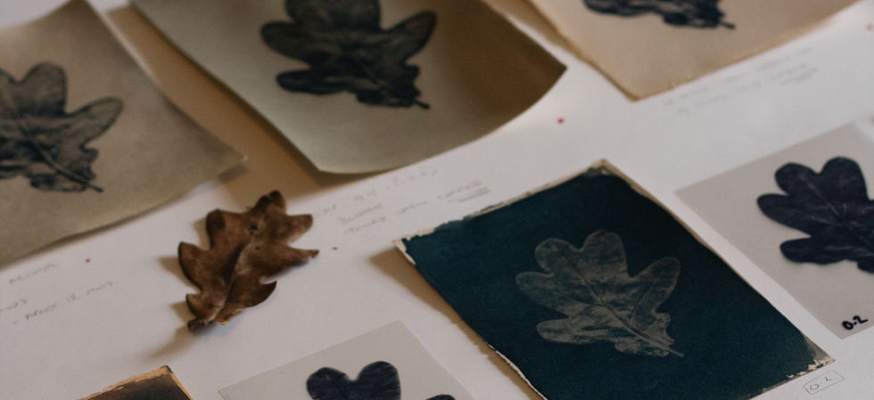
At the heart of the Birnam Hotel brand is a small but meaningful motif: a single fallen Oak leaf from the ancient Birnam Oak, located just a short walk from the hotel. Discovered by Kim, this leaf became the foundation of the visual identity. Working from the original leaf, I produced a series of Cyanotype test prints, exploring different botanical toning methods before arriving at the final toned print. The final piece will take pride of place in the hotel lobby.
From this initial image, the Oak leaf was simplified and refined into a logo mark, forming the core of the hotel’s branding and printed ephemera. Kim and I undertook extensive research into historic font foundries to ensure a cohesive and authentic typographic language across the wider brand, supporting the sense of heritage and place.
Also featured as part of the project are letterpress printed gift cards, produced in my studio on my Heidelberg Windmill press. These pieces further enhance the historic and tactile qualities of the branding, contributing to the hotel’s refined yet grounded aesthetic.


